How to make three Column Layouts in Blogger Template?
Why Using three columns in a template?
this kind of template gives you more space to add your ads and banners and make your website feel more equilibrated.
Create three columns in classic blogger templates and follow in easy steps
First of all, set your template to Minima (not the stretch template, but any color will do!), then follow these instructions:
1. Go to Template>Edit HTML, leaving the "Expand widget templates" box unchecked.
2. Now, find this section in the HTML code:
#sidebar-wrapper { width: 220px; float: right; word-wrap: break-word; /* fix for long text breaking sidebar float in IE */ overflow: hidden; /* fix for long non-text content breaking IE sidebar float */ }
Copy this entire section, and paste it directly below. We're going to change the elements I've highlighted in red to the following:
#left-sidebar-wrapper (this makes the CSS for this section unique) float: left (this will make the new sidebar float to the left of the main column)
This will provide the styling for the new sidebar element which we will create next.
3. Now, you need to find this section further down the page:
Immediately before this section, you should paste the following piece of code:
4. If you preview your template, you will notice that the right sidebar will be beneath the main section at the moment. This is because the outer-wrapper is still only wide enough to accommodate one sidebar. So now we need to expand the outer wrapper to accommodate this new sidebar. Find this section in the HTML code:
/* Outer-Wrapper ----------------------------------------------- */ #outer-wrapper { width: 660px; margin:0 auto; padding:10px; text-align:left; font: $bodyfont; }
We need to increase the width of the wrapper by the width of the left-sidebar-wrapper, in this case, 220px. So, change the value in red to 880px.
5. You may also want to change the width of the header-wrapper to 880px so that it spans the new width of your blog:
#header-wrapper { width:880px; margin:0 auto 10px; border:1px solid $bordercolor; }
6. At this point, you should save your template. At present, your new sidebar will not be seen as there are no widgets contained within it, though it will still be present in the markup of the page. Once you have saved your template, go to Template>Page elements in your Blogger dashboard.
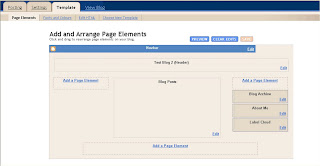
7. Your layouts section should now look something like this:

You can now add a page element (or two) to your new left sidebar.
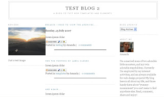
8. But we aren't quite finished yet! If you add anything to this left sidebar, you will probably notice that it jams right up to the main section, like this:

This is because there is no space defined between the left-sidebar and the main section. We need to create this space in the template's HTML. To do this, we will add a margin to the left-hand side of the main posts section. Find the following code in your template's HTML and add the code defined in red
#main-wrapper { width: 410px; float: left; margin-left: 20px; word-wrap: break-word; /* fix for long text breaking sidebar float in IE */ overflow: hidden; /* fix for long non-text content breaking IE sidebar float */ }
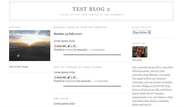
This defines a margin space of 20px between the left-sidebar and the main column. You should also ensure you adjust the width of the outer-wrapper from 880px to 900px to ensure the width of your blog is enough to accommodate this margin too. Either that or you could reduce the width of your main column/a sidebar by 20px to serve the same purpose. Now, your previewed template should look more like this:

9. Finally, save your template and enjoy your new sidebar!

No comments :
Post a Comment